New trend option: ‘vs last year’
We have a new trend comparison option that lets you compare reports and graphs vs the same date or date range from the previous year. For example, April 6 2014 vs April 6 2013, or April 1-6 2014 vs April 1-6 2013.
You can see this new option in the date menu for any graph:
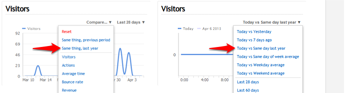
You can also set this as your default trend option in your dashboard preferences. In this case, vs last year will always be the default graph comparison, but last year will also be used in to calculate the trends we report (the red/green percentages next to each number in most reports).
Universal Analytics: Out of beta, into primetime
Feature parity with Classic Analytics, new reports, better user-centric analysis
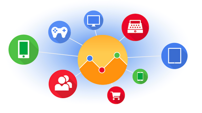
 |
| New Cross-Device Reports in GA let you see the full customer journey (click image for full-size). |
Time Zone Based Processing: Fresher, more timely data


HTML5 audio, embedded actions, tracking code verification, and better cookies
We wanted to let you all know about some of the bigger things we’ve been working on the last month that you may not have noticed. None of them felt major enough to warrant their own post, so we were waiting until we had a nice collection of goodies.
HTML5 audio, and automatic HTML5 video/audio tracking
We’ve had support for HTML5 video tracking for a while, it simply required adding an additional javascript file to your code. We just added the ability to track audio as well. We combined video and audio together into their own report, now called Media, since they are quite similar in terms of the metrics we track — and it’s unlikely that many sites would have a mix of both.
Even better, we made it so you no longer need to include the extra javascript file at all. When the tracking code detecst any video or audio elements on your web site, it will now automatically inject the other javascript file into your page so we can track the video and audio files without you having to do anything. Don’t worry, if you already had that file included manually, you don’t need to delete it. It will work either way.
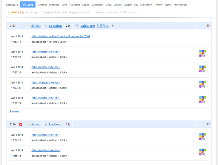
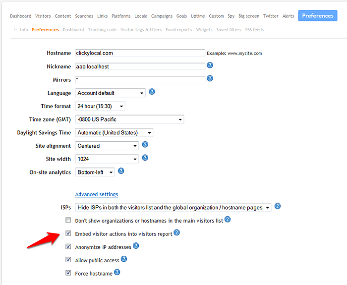
Embedded actions in the visitors report
This new preference, disabled by default, adds some additional detail into the standard visitors report. Now you will no longer need to click through to see the actions (page views, etc) of each visitor. The first five actions will be displayed right beneath each visitor, with a link below them to see full session details if there are more than five actions.
Note that this will slow down the loading of the visitors report by a somewhat noticeable measure since we have to query for a lot more data, but, it’s pretty nice if that’s what you’re into.
Here’s what it looks like:
Here’s where you enable this new preference:
Tracking code verification
We released this feature a bit prematurely, not expecting too many people to notice it right away, but we got bombarded with emails immediately saying the verification doesn’t work! Whoops. There were a few bugs that we got quickly fixed.
This is a nice feature to check out if you think you got the code or a plugin installed but you’re not getting any stats. This will verify for you that the code is at least installed on the site. You can access this feature on your tracking code page:
![]()
Better cookies
The cookie system we have been using since October 2012 to authenticate yourself when you’re on your own web site (which then auto-ignores your visits and loads the on-site analytics widget)… was a bit less than ideal.
The biggest problem was that we used a single cookie for two different features (widget and auto-ignore). On top of that, the cookie was always set, and it would stay set (for a year) even if you clicked the logout button. The reason we wanted it to stay set was so that your visits would always be auto-ignored, but it was a bit of a security issue in terms of the same cookie being used to authenticate on-site analytics. The chances of anyone ever seeing anything via the widget that they shouldn’t have were microscopic (it would only happen on a shared machine and only if you logged into both Clicky and your web site, and someone after you looked at your history and also visited your web site), but that’s no excuse.
So, we’ve changed several things here. There are now two unique cookies for each feature: one for the widget and one for auto-ignore. When you logout, the widget cookie is deleted, but the auto-ignore cookie stays set so your own visits will continue to be ignored. Last, the expiration time of the widget cookie was shortened to 90 days (from 1 year previously).
That about wraps it up for now, but there’s plenty more in the pipeline!
Mastering the science of random chance: Dataless Decision Making comes to Analytics Academy

Web analytics help marketers measure success of social media campaigns
Analytics can help marketers
improve social media campaigns
In social media marketing, small adjustments can make campaign performance soar or cause efforts to fall flat. Web analytics can help marketers make these miniscule adjustments that can make or break a campaign.
For example, during major events, Twitter users may not be unified on which hashtag they are using in tweets. Many people
Sending data from Lantronix to Google Analytics


Tell a Meaningful Story With Data

This article was originally posted on Google Think Insights.
Most organizations recognize that being a successful, data-driven company requires skilled developers and analysts. Fewer grasp how to use data to tell a meaningful story that resonates both intellectually and emotionally with an audience. Marketers are responsible for this story; as such, they’re often the bridge between the data and those who need to learn something from it, or make decisions based on its analysis. As marketers, we can tailor the story to the audience and effectively use data visualization to complement our narrative. We know that data is powerful. But with a good story, it’s unforgettable.
Rudyard Kipling once wrote, “If history were taught in the form of stories, it would never be forgotten.” The same applies to data. Companies must understand that data will be remembered only if presented in the right way. And often a slide, spreadsheet or graph is not the right way; a story is.
Executives and managers are being bombarded with dashboards brimming with analytics. They struggle with data-driven decision making because they don’t know the story behind the data. In this article, I explain how marketers can make that data more meaningful through the use of storytelling.
The power of a meaningful story
In her “Persuasion and the Power of Story” video, Stanford University Professor of Marketing Jennifer L. Aaker explains that stories are meaningful when they are memorable, impactful and personal. Through the use of interesting visuals and examples, she details the way people respond to messaging when it’s delivered either with statistics or through story. Although she says engagement is quite different from messaging, she does not suggest one over the other. Instead, Aaker surmises that the future of storytelling incorporates both, stating, “When data and stories are used together, they resonate with audiences on both an intellectual and emotional level.”
In his book Facts Are Sacred, Simon Rogers discusses the foundations of data journalism and how The Guardian is using data to tell stories. He identifies ten lessons he’s learned from building and managing The Guardian’s Datablog, a pioneering website in the field. I found three of the lessons particularly insightful:
- Data journalism (and analytics in a broader sense) is a form of curation. There is so much data and so many data types that only experienced analysts can separate the wheat from the chaff. Finding the right information and the right way to display it is like curating an art collection.
- Analysis doesn’t have to be long and complex. The data collection and analysis process can often be rigorous and time consuming. That said, there are instances when it should be quick, such as when it’s in response to a timely event that requires clarification.
- Data analysis isn’t about graphics and visualizations; it’s about telling a story. Look at data the way a detective examines a crime scene. Try to understand what happened and what evidence needs to be collected. The visualization—it can be a chart, map or single number—will come naturally once the mystery is solved. The focus is the story.
Stories, particularly those that are meaningful, are an effective way to convey data. Now let’s look at how we can customize them for our audiences.
Identify the audience
Most captivating storytellers grasp the importance of understanding the audience. They might tell the same story to a child and adult, but the intonation and delivery will be different. In the same way, a data-based story should be adjusted based on the listener. For example, when speaking to an executive, statistics are likely key to the conversation, but a business intelligence manager would likely find methods and techniques just as important to the story.
In a Harvard Business Review article titled “How to Tell a Story with Data,” Dell Executive Strategist Jim Stikeleather segments listeners into five main audiences: novice, generalist, management, expert and executive. The novice is new to a subject but doesn’t want oversimplification. The generalist is aware of a topic but looks for an overview and the story’s major themes. The management seeks in-depth, actionable understanding of a story’s intricacies and interrelationships with access to detail. The expert wants more exploration and discovery and less storytelling. And the executive needs to know the significance and conclusions of weighted probabilities.
Discerning an audience’s level of understanding and objectives will help the storyteller to create a narrative. But how should we tell the story? The answer to this question is crucial because it will define whether the story will be heard or not.
Using data visualization to complement the narrative
Analytics tools are now ubiquitous, and with them come a laundry list of visualizations—bar and pie charts, tables and line graphs, for example—that can be incorporated into reports and articles. With these tools, however, the focus is on data exploration, not on aiding a narrative. While there are examples of visualizations that do help tell stories, they’re rare and not often used in meetings and conferences. Why? Because finding the story is significantly harder than crunching numbers.
In their “Narrative Visualization: Telling Stories with Data” paper, Stanford researchers discuss author versus reader-driven storytelling. An author-driven narrative doesn’t allow the reader to interact with the charts. The data and visualizations are chosen by the author and presented to the reader as a finished product, similar to a printed magazine article. Conversely, the reader-driven narrative provides ways for the reader to play with data.
With the advent of data journalism, we’re now seeing these two approaches used together. According to the Stanford researchers, “These two visual narrative genres, together with interaction and messaging, must balance a narrative intended by the author with story discovery on the part of the reader.”
A good example of a hybrid author-reader approach is the presentation of The Customer Journey to Online Purchase tool. A few short paragraphs explain why the tool was created and how it works, and an interactive chart allows marketers to break down the information by industry and country. Additional interactive data visualizations provide even more context.
Another extremely efficient and visual way to tell a story is by using maps. In a tutorial on visualization, I show how a large data set can be transformed and incorporated into a story. It’s an example of how to take charts and graphs to the next level in order to add value to the story. In this case, I use Google Fusion Tables and some publicly available data to illustrate analytics data with colorful, interactive maps. The visualization provides more content for those interested in diving deeper into the data.
A good data visualization does a few things. It stands on its own; if taken out of context, the reader should still be able to understand what a chart is saying because the visualization tells the story. It should also be easy to understand. And while too much interaction can distract, the visualization should incorporate some layered data so the curious can explore.
Marketers are responsible for messaging; as such, they’re often the bridge between the data and those who need to learn something from it, or make decisions based on its analysis. By rethinking the way we use data and understanding our audience, we can create meaningful stories that influence and engage the audience on both an emotional and logical level.
Posted by Daniel Waisberg, Analytics Advocate

Understand the full value of TrueView ads with the new Video Campaigns report
 |
| Click for full-size image |

 |
| Click for full-size image |

3 tools to measure B2B lead generation
Web analytics can help marketers measure
the effectiveness of their campaigns
Marketers know they need to measure the effectiveness of their
campaigns, but there are several other factors that can influence
conversion. B2B lead generation
is more complex than B2C because of the longer buying cycle, and if a
website has a poor user experience, it can sway prospects in the wrong
direction.
ClickTale Integrates With Adobe Analytics to Reveal 360-Degree View of Customers’ Digital Experience
It’s a great day for us here at ClickTale! We’ve just announced our integration with Adobe Analytics, a key solution in the Adobe Marketing Cloud.
Ashish Braganza, Director Global Business Intelligence at Lenovo was quoted as saying, “The ClickTale and Adobe Analytics integration has given us a much deeper understanding of how different customer segments experience and navigate our website,” said Ashish Braganza, Director Global Business Intelligence, Lenovo. “It’s the perfect combination of segmentation and visualization.”
The integration of ClickTale and Adobe Analytics enables users to:
• Identify and assemble high-value audiences/segments
• Analyze custom Adobe Analytics segments within ClickTale’s reports to deliver specific observations and recommendations
• Optimize conversion paths for chosen Adobe Analytics segments
• Watch videos of anonymous visitors’ browsing sessions to reveal the factors driving or impeding customer success
• Use the insights from ClickTale to test and deliver optimal user experiences for each audience defined in Adobe Analytics
This week the ClickTale team will be exhibiting at the Adobe US Summit held in Salt Lake City, UT between the 24-28th of March. Dr. Tal Schwartz, ClickTale’s CEO, will also be speaking at the summit conference on Wednesday 26th March together with, Ashish Braganza from Lenovo where they’ll discuss how to make big data actionable along with Lenovo’s utilization of this integration.

Please share your thoughts in the comments section or on Twitter, or Facebook where we are always listening.
Want to learn more about how the ClickTale system can help you optimize your website and increase conversion rates? Click here.
Recent Comments